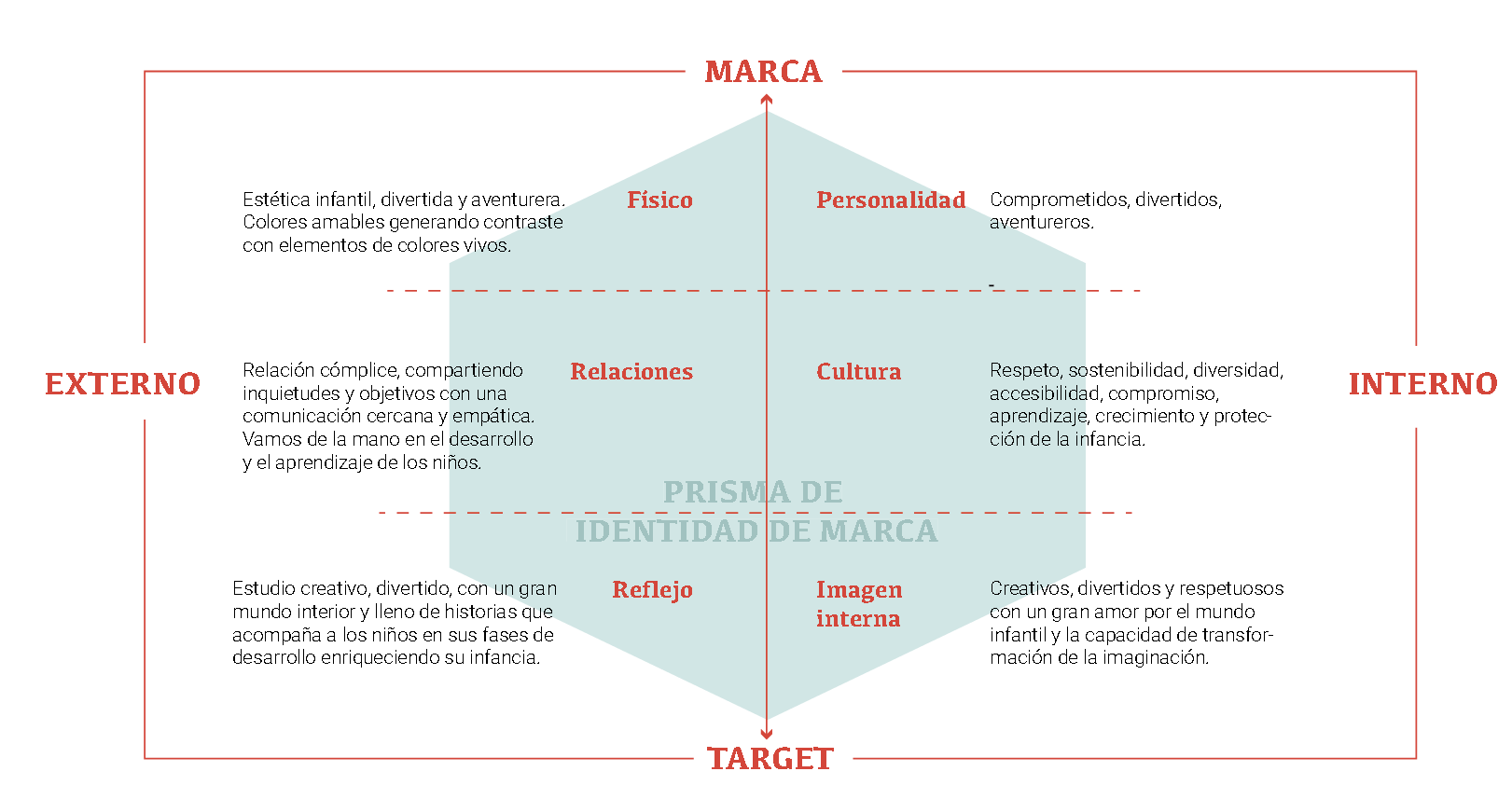
Branding design for a studio dedicated to design products and experiences for kids.
In Kid on the Tree we want to create a physical and virtual space where children find no limits to their imagination and have tools that enhance their learning, where they feel challenged and accompanied, designed exclusively for them, where respect, diversity and sustainability are the inherent values in each project.
And above all, without forgetting the most important thing, having fun.
Our mission is to accompany children in their development by designing products and experiences both in physical and digital in both physical and digital environments, focused on learning and education.
We want to focus our knowledge, efforts and design techniques to improve the environment and learning of children, embracing new technologies when their use fulfills a function, and conquering non-virtual spaces for children to enhance their educational capacity.
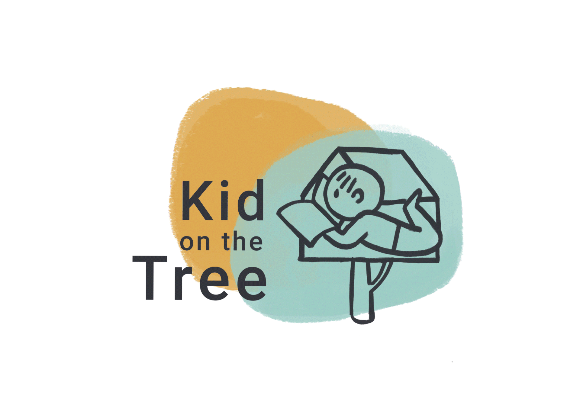
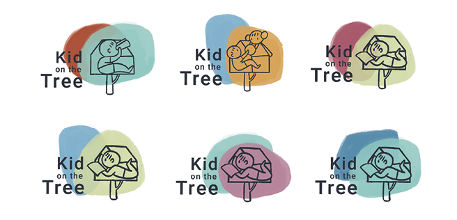
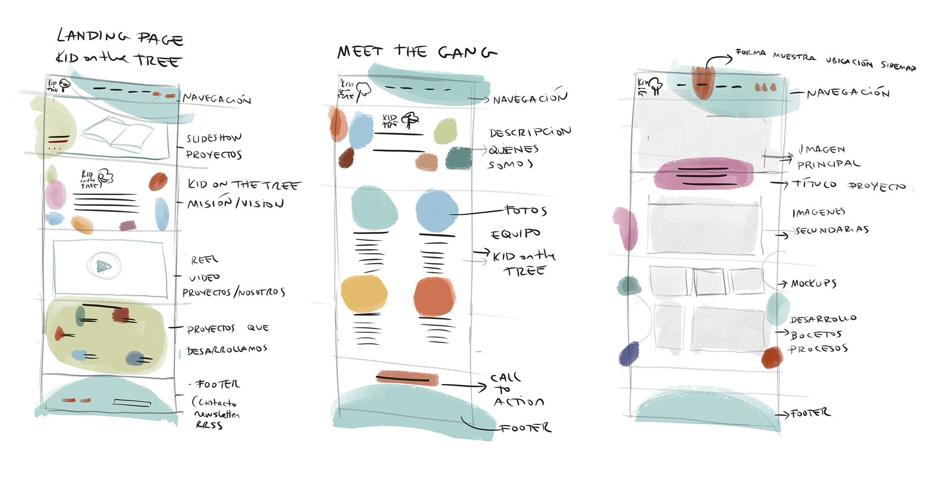
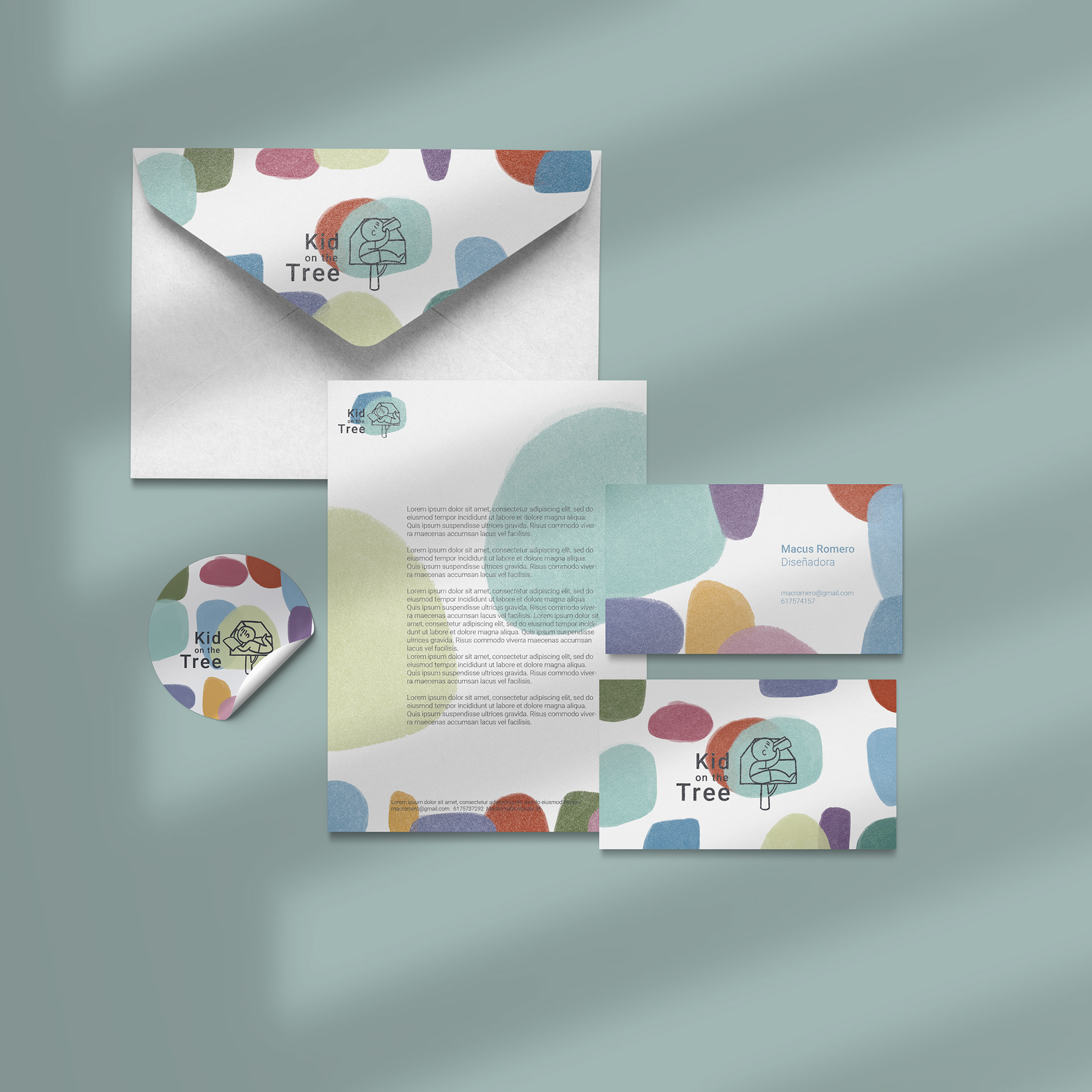
The world of children is dynamic, fun, without rules, tangled, chaotic and colorful.
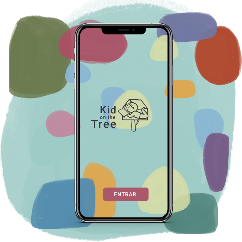
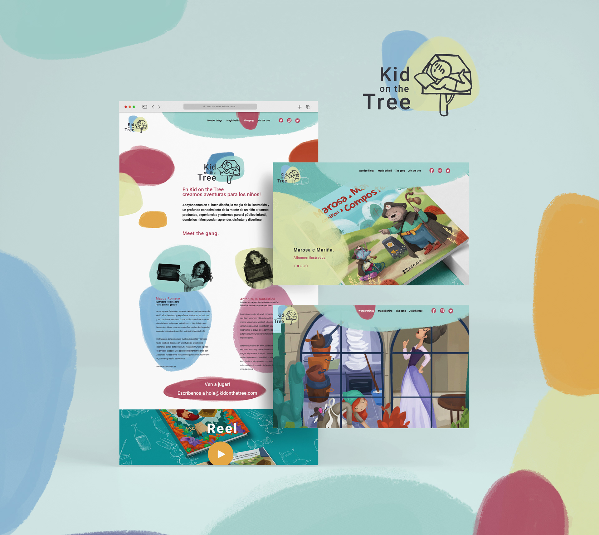
The brand wants to transmit this dynamism and fun through the use of a lively and varied chromatic range, a dynamic logo, and the support of colorful shapes and casual lines for illustrations that accompany the corporate material or the various services offered by the studio.
Textured colorful shapes, thick lines, colors coming out of the shapes, casual drawings. The illustrations want to transmit that dynamic space that we want to create for children with our projects through the colorful shapes that surround the drawing, while the drawing stands out from the shape overcoming it and growing beyond it.